Denver Airport Website: Case Study
13 min read
Time-frame
3 Weeks
Software
Sketch, InVision
3 Weeks
Software
Sketch, InVision
Brief
I was on a team of four designers working with Spire Digital. We created a website redesign for the Denver Airport. Spire has a long-standing relationship with the airport, having designed the current site five years ago. Our role was to dive into research and uncover the biggest opportunities for improvement. From there, we would design effective and informed solutions for a new website.
These were the questions we asked ourselves:
How can we improve the airport experience?
How can we improve existing digital solutions or offer a unique solution?
How can we improve the airport experience?
How can we improve existing digital solutions or offer a unique solution?
My Role
I took a holistic approach to the UX process, meaning I was hands-on with all phases of research, testing, design, and prototyping. My specific focuses included Google Analytics and competitor research, as well as completing the homepage and dining page re-designs in Sketch. I also played a key role working on brand identity, including coming up with the color pallet and selecting photos. Lastly, I was responsible for InVision prototyping.
As far as shared roles, our group worked to research, interview, and perform usability tests. We then ideated and synthesized information together and collaborated on all parts of the design.
Understanding the Traveler's Motivations
We knew that a project of this size would demand in-depth research. For context, the Denver airport had 64.5 million passengers in 2018, as well as 35,000 on-site employees. On top of that, Denver is the fifth busiest airport in the U.S. because of its central location and was even voted the Best Airport in the U.S. by the Wall Street Journal.
In many ways an airport is like a small city, it requires large amounts of infrastructure to facilitate large groups of diverse people with different goals. Designing a digital solution would require us to take a step back and understand the traveler and their core motivations.
We had to work to understand the pain points travelers encounter as well as the unique value propositions of the Denver airport.
Surveys
To identify pain points of travel, we created a survey with questions designed to identify broader trends and use-cases of travelers. We received a total of 389 responses.
How often do you fly?
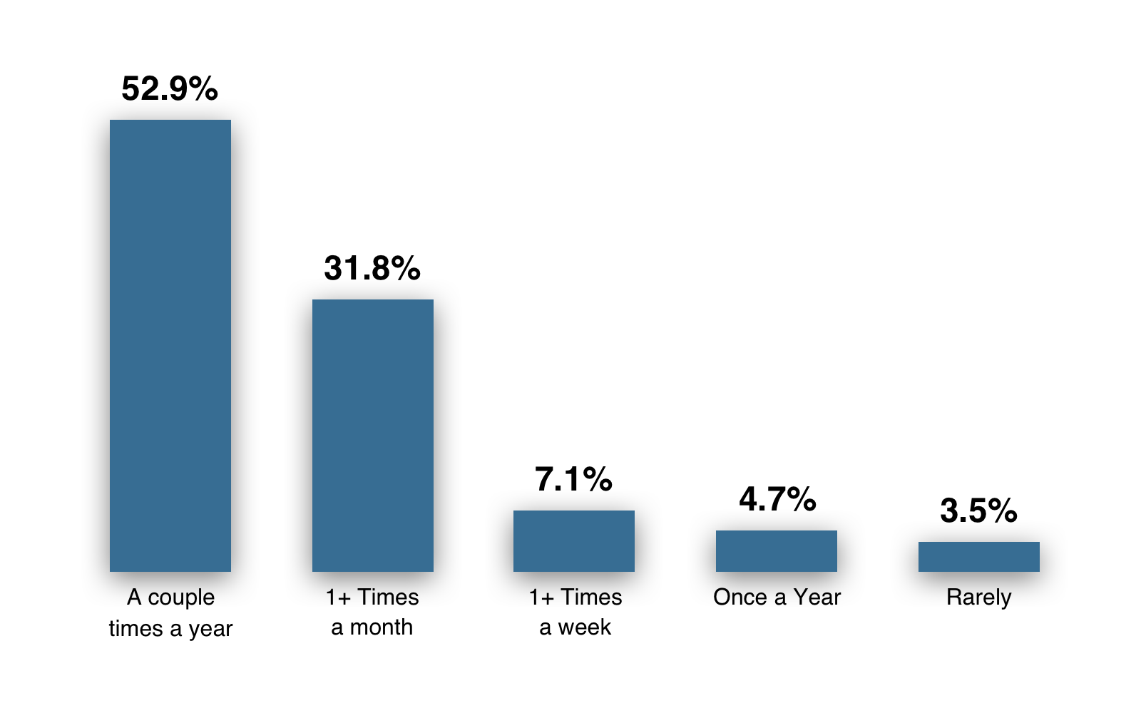
Key Insight: Most people have limited exposure to the airport and would benefit from user-friendly digital tools.
What is your preferred method of travel to the airport?
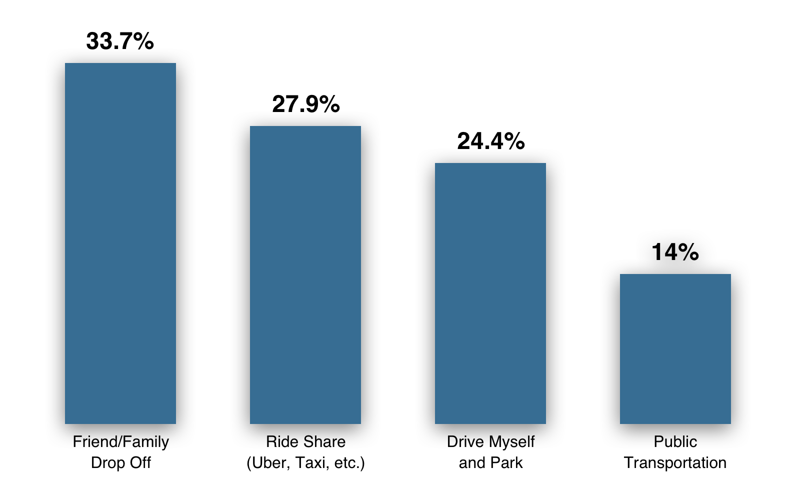
Key Insight: While people have different preferences when it comes to getting to the airport, 86% of travelers need to rely on parking and drop off information.
What are the pros and cons to airport travel?
Enjoy
• Speed and efficiency
• New places
• Dining and entertainment options
• People watching
• New places
• Dining and entertainment options
• People watching
Pain Points
• Slow travelers
• Security
• Navigation
• Construction
• Security
• Navigation
• Construction
Our survey taught us a lot about the patterns and trends of travelers, but we knew we needed to do some in-person interviewing to change the context from anonymous to personal.
Field Studies at Denver Airport
We spent a day doing field studies. To start, we rode the light rail from downtown Denver to the airport. On our way, we interviewed travelers and RTD security to see if we could gain any insights before arriving. Due to the specifics of the proposal, we were not permitted to interview airport staff.

RTD and Tourism Employees
“So many people don’t plan, there is no in between of preparedness, they either have no idea, or are resourceful enough to answer their own questions.” -RTD Security Guard
“Signage is bad, we aren't effectively communicating that we have a mobile app. People with the RTD app don’t have questions.” -RTD Security Guard
"Only 25% of my questions are about Denver, mostly people want to know the location of restrooms, check-in, security, baggage, and rideshare. Signs are not very clear in their verbiage." -Employee at Tourist Info Booth
Traveler Quotes
"When I am on the website I want to know who, what, where and when!" -Traveler
"I spend my time at the charging stations and once I'm fully charged I go shopping and look for something to eat!" -Traveler
"The airport is an eyesore right now." -Traveler
It stood out to us that very few people had ever visited the website. Of those that did, their motivations included the desire to prepare for their travels or the need to solve a problem.
A main takeaway from our interviews was that people who use the website tend to encounter less friction in their travels, however the airport needs to effectively market their digital presence in order to increase adoption. Once we get someone on the site, we need to address that they are on the go and looking to get their information quickly and easily.
Business Needs
At this stage, we had an idea of the pain points and areas of opportunities, but now it was time to learn what about the business and technical constraints for the website.
We interviewed Adam, the President of Spire Digital, and Sara, VP of Operations. Both of them are key players in the relationship with Denver Airport as well as contributors to the original website design.
"Our goal is a overall new look and feel, content has been a challenge as well as figuring out what's most important to the user. There is a huge opportunity to make the images and content more engaging." -Sara Szynskie
"We are so proud of Denver. The first moment getting off an airplane is their introduction to Colorado, and we want a website to reflect that." -Adam Hasemeyer
"In my opinion, users visit the website to learn things - gate location, park, wait times. We need to ensure they are leaving with the information that they came for." -Sara Szynskie
Stakeholder needs for the website include:
• Improve the airport travel experience
• Make the website accessible
• Show unique shops and dining experiences
• Highlight Colorado culture
• Improve brand recognition
• Make the website accessible
• Show unique shops and dining experiences
• Highlight Colorado culture
• Improve brand recognition
The stakeholders also shared that the airport is in the midst of re-branding, moving from DIA to DEN — something that is still unknown to many people. Our redesign needed to highlight this change. These interviews helped us balance what we were hearing from travelers with what the business requires of the site.
Travelers want to find important information about the airport quickly in order to have a smooth experience, stakeholders want to highlight specific things about Colorado culture and business. The website would have to facilitate all of these things to be successful.
With our surveys, field studies, and interviews we were starting to see trends in the motivations of travelers and understand the "Why". Now we needed to contextualize these findings to the website's usage and dig into the objective numbers to find the "What". We started with an analysis of airport statistics and google analytics.
Traveler Behaviors
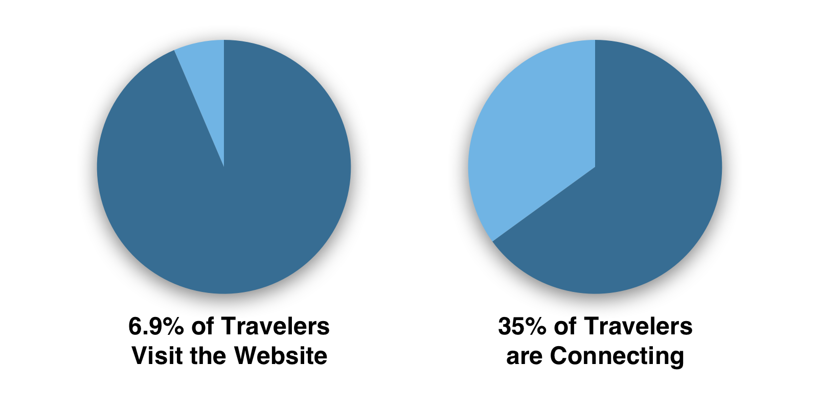
The usage statistics for the site validated what we learned during our interviews: there is a very small percentage of passengers using the website. Out of 6.7 million monthly passengers, only 6.9% are using the website. It's worth noting that the small percentage still amounts to nearly half a million site visitors. The content on the site addresses many problems that travelers run into, so we know that increased usage would would benefit their experience.
65% of travelers at Denver Airport are flying to or from Denver, and 35% are connecting. This tells us the majority of people are going to have a vested interest in the culture and offerings of Colorado beyond just their airport experience. Considering this data and Adam's input, we knew we needed to highlight and curate information about our state and airport.
Google Analytics
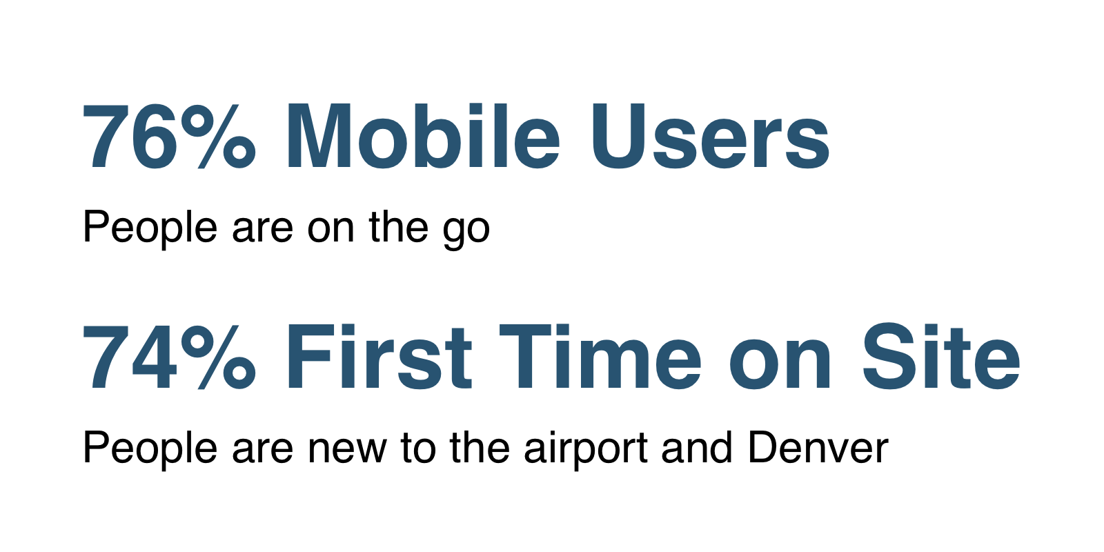
Seeing that most people are on the go and first time users of the site, this shows us our primary use case, and the need for at-a-glance information. We want users to find their answer quickly so they can get back to traveling.
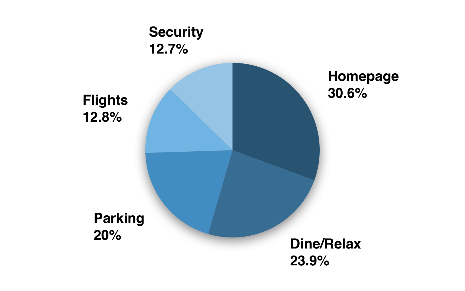
Looking at the most visited pages, we realized people are either finding where they should park, eat or shop, or they are checking flight and security information. The most common flow was to land on the homepage and then go to the flights page to check a plane's status. The popularity of this flow let us know this is a priority feature.
The page that contained dining and shopping information was the second most visited, which contrasted many of our interviews. The numbers showed that people are very interested in these activities while at the airport. This supports our feature opportunity to highlight unique restaurants and improve usability for finding dining and shopping opportunities.
At first look, we thought parking was not a popular feature. Upon further inspection, we realized that when we totaled the five different pages related to parking it made up 20 percent of the traffic. This shows that there is a big user need for this information, but it is spread across the website and would benefit from consolidation.
We knew a successful airport website would need to find ways to connect with travelers before, during, and after their journey.
Now that we had sufficient qualitative and quantitative data to recognize pain points, as well as the motivations behind our users and stakeholders, it was time to dive into the details. We needed to do a heuristic analysis to identify why features were not working in order to begin building solutions.
Heuristic Analysis
We analyzed the existing site using Jakob Nielsen's 10 principles of web usability. We completed 78 questions based on these principles, with the answers ranging from 1-5. This resulted in a usability score of 71/100, which is moderate and showed room for improvement.
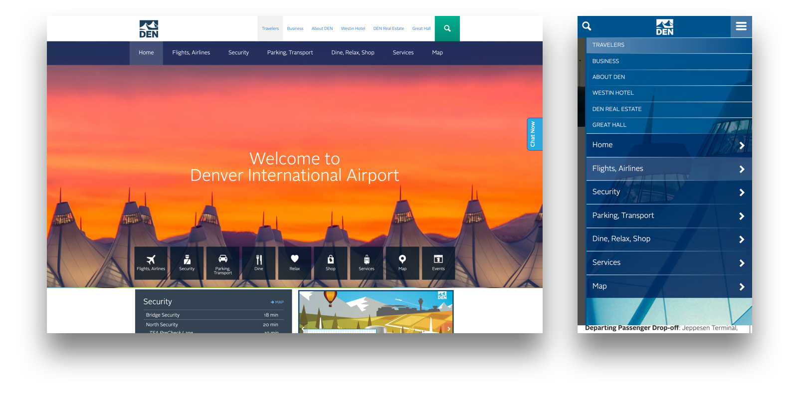
When looking at the homepage on mobile or desktop, it has 13 options in the header or hamburger. Additionally, there are nine redundant calls to action, which creates cognitive overload when trying to navigate.
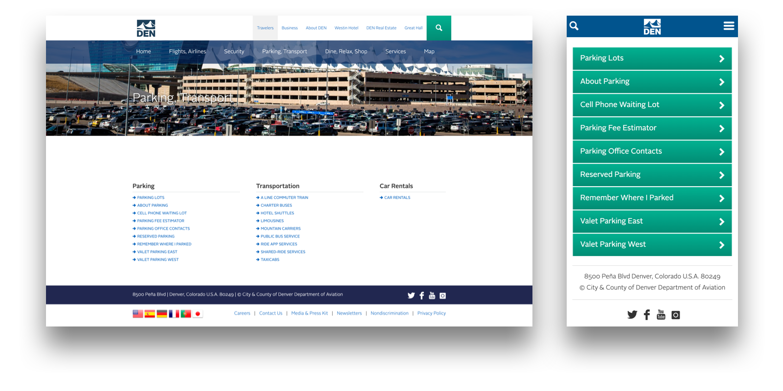
When you go to the parking landing page, you are presented with 13 different hyperlinks and 26 on services with no clear hierarchy. This explains the google analytics showing traffic spread across so many different pages.
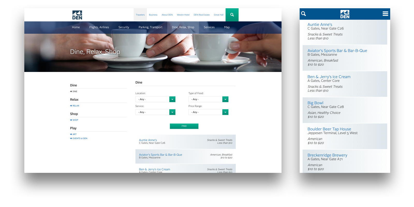
The flights, security, and the combination dining and shopping pages all utilize long lists of information that lack any clear information hierarchy. It is difficult to get what you need at a glance, as they use little to no visuals and rely on large blocks of text.
Usability Testing
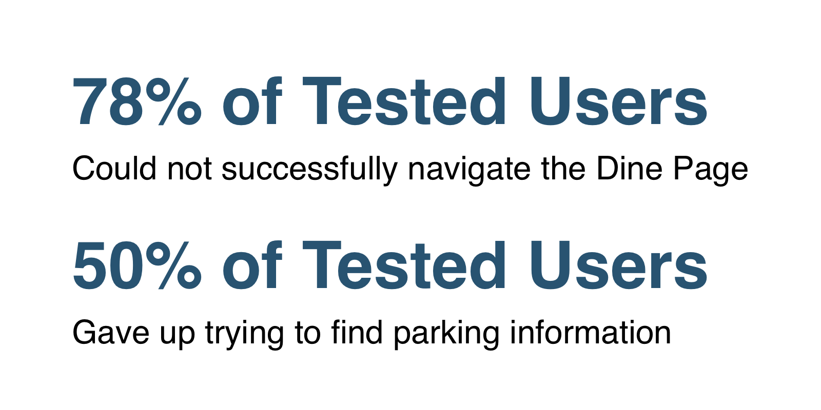
We conducted usability tests with nine people to evaluate the current website design. Our aim was to identify issues that users encountered and hopefully validate assumptions we made during our heuristic analysis.
To do this, we developed three tasks surrounding hypothetical situations for our participants to complete. We based these tasks around areas of opportunity we identified in our heuristic analysis, such as the redundant navigation. In addition to these tasks, we posed a range of questions about the current website to understand how people interacted with it.
Navigation Quotes
"I feel overwhelmed between the two sections of information."
"A lot of the tiles indicate the same stuff as the header."
"I am visual and this list isn’t very helpful."
"The airport is large and hard to navigate, I need to be able to get my information easily. "
"A lot of the tiles indicate the same stuff as the header."
"I am visual and this list isn’t very helpful."
"The airport is large and hard to navigate, I need to be able to get my information easily. "
Information Quotes
"There are so many parking options, I think I want the west side? But I am not sure, this is way more clicks than it needs to be."
"The worst experience was parking, that's gonna be a problem."
"What they don’t tell me is the hours for the restaurant, is it open 24 hours? It took more time than it should have, hours should not be under service. A filter would be nice."
"I am just scrolling dine options and have to click each one to find hours."
Brand Impression Quotes
"The banner feels like it was designed for the airport, not for me."
"A sense of Denver is absent from the website. It could be implemented better."
"A sense of Denver is absent from the website. It could be implemented better."
To summarize our usability testing, we found a lot of evidence that our heuristics were highlighting the right issues. The information across the website is presented in an abstract and divided way, making the user do more work than they should to get their answers.
Synthesis and Feature Prioritization
We took our data and parsed the trends, pain points and opportunities. We then used these to develop personas that would resemble our most common use cases.

Brad, 44
Business Traveler
Business Traveler
Frustrations
• Crowded airports
• Airport delays/closures
• Non-travelers/confused travelers
• Crowded airports
• Airport delays/closures
• Non-travelers/confused travelers
Laura, 27
Leisure Visitor
Leisure Visitor
Frustrations
• Unfamiliar airports
• Wasting time
• Uninformed of local faves
• Unfamiliar airports
• Wasting time
• Uninformed of local faves


Melissa, 35
Family Traveler
Family Traveler
Frustrations
• Crowded airports
• Rude people
• Managing children & travel
• Crowded airports
• Rude people
• Managing children & travel
We decided to focus on the five pages with the most traffic on the site for our MVP. With our personas in mind, we started ideating features that addressed our pain points and biggest opportunities. We mixed hand sketching with white-boarding feature lists. After this session, we performed a MoSCoW prioritization and focused in on our desired features.
Biggest Opportunities
• Better information architecture for navigation
• At-a-glance information and use of visuals
• Digital tools to solve user problems
• At-a-glance information and use of visuals
• Digital tools to solve user problems
Mid-Fi and Visual Pivot
Our first iteration operated entirely within the current visual style guide of the Denver airport. We took this design to the team at Spire for critique and collectively concluded that we should pitch a fresher design, outside of the style guide. With this new direction, we had the creative freedom to try a different color palette and think outside the box.
Our new approach gave us an opportunity to capture the creative and welcoming nature of the Denver International Airport and Colorado culture. We created a color palette based on the hues of a Colorado sunset. Additionally, we included photography that evoked more emotion about travel and the uniqueness of the airport. From there we established graphic motifs that were bolder and made more of a statement. We relied on all of these elements to capitalize on the current re-branding from DIA to DEN.
Solutions
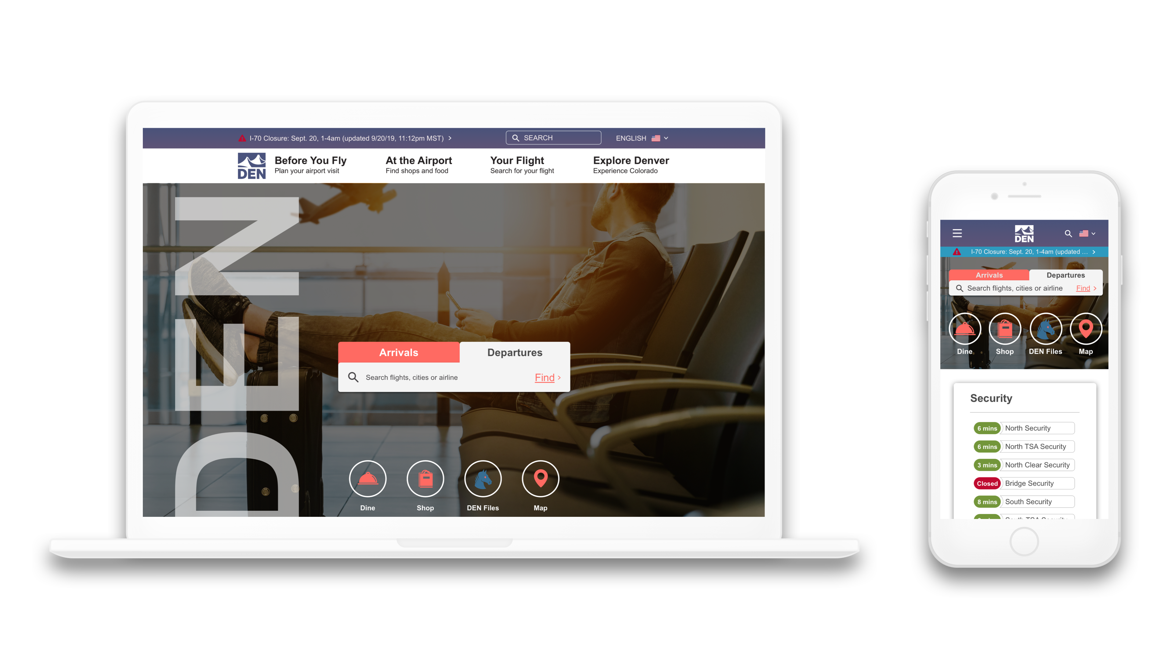
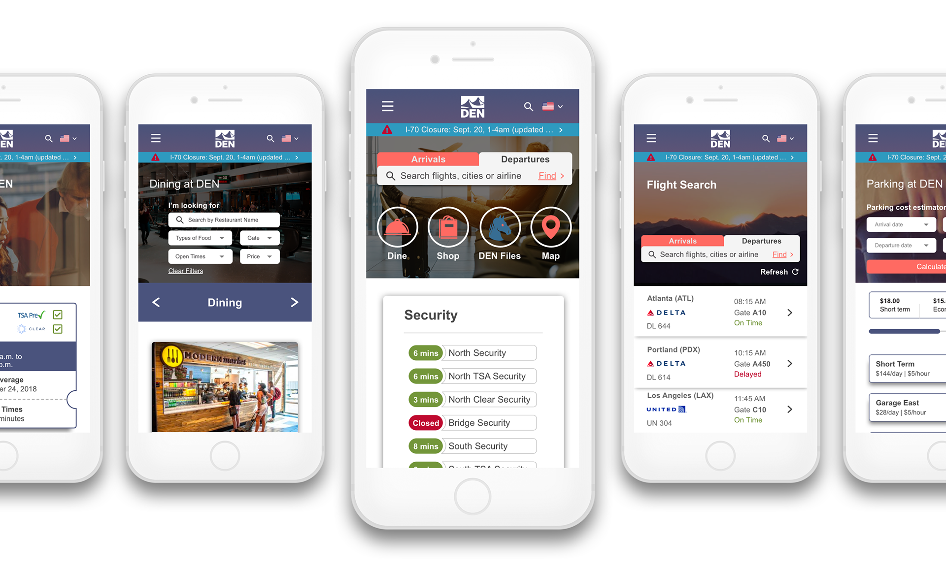
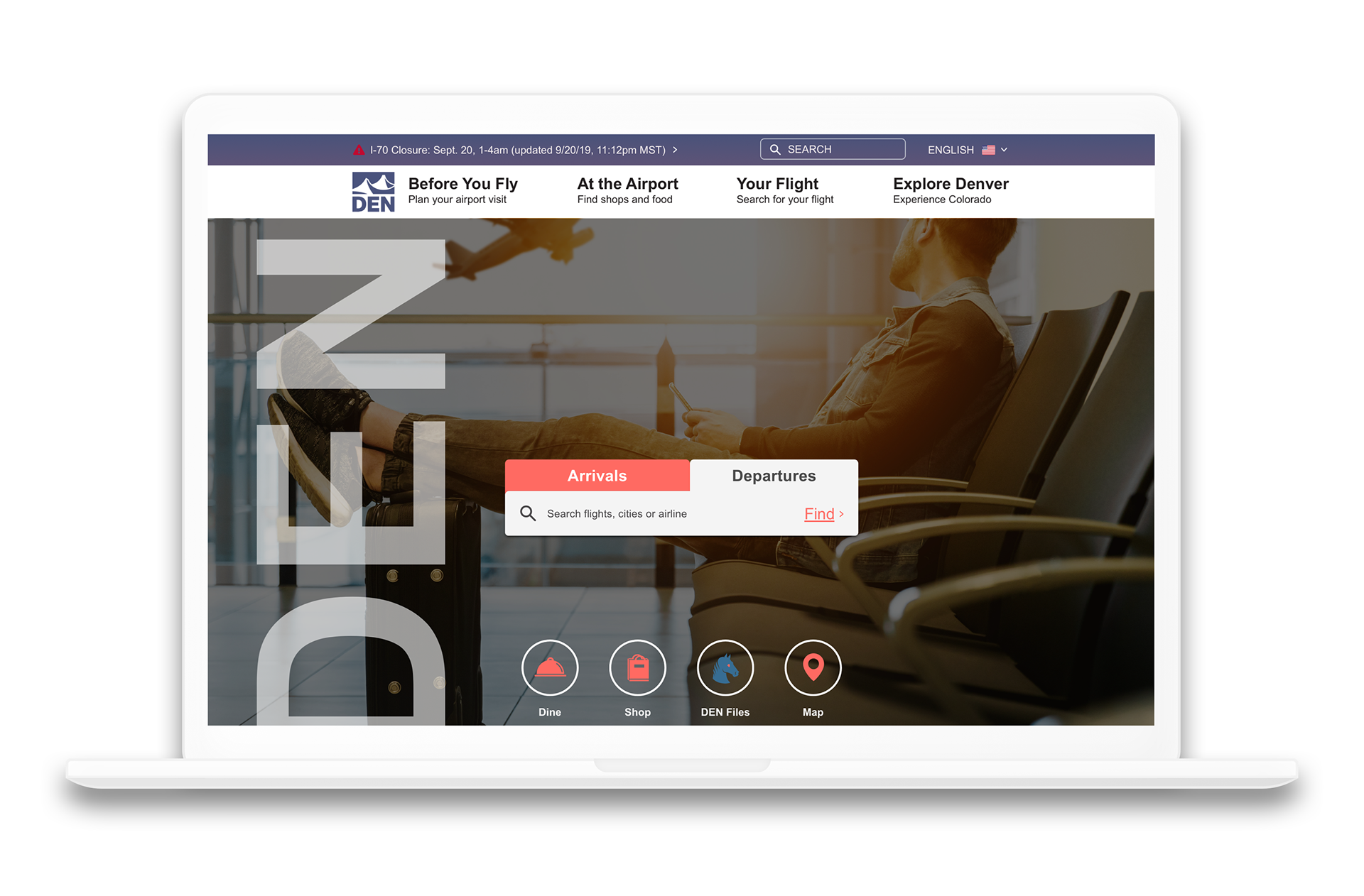
When it comes to information architecture, our first and most impactful solution was to reduce the number of categories found in the header and tiles. Through the use of more accessible language, we created categories that were easy to understand at a glance: Before you Fly, At the Airport, Your Flight, and Explore Denver. We took any information that wasn't vital and included it in the header or a secondary menu and prioritized weather and construction warnings.

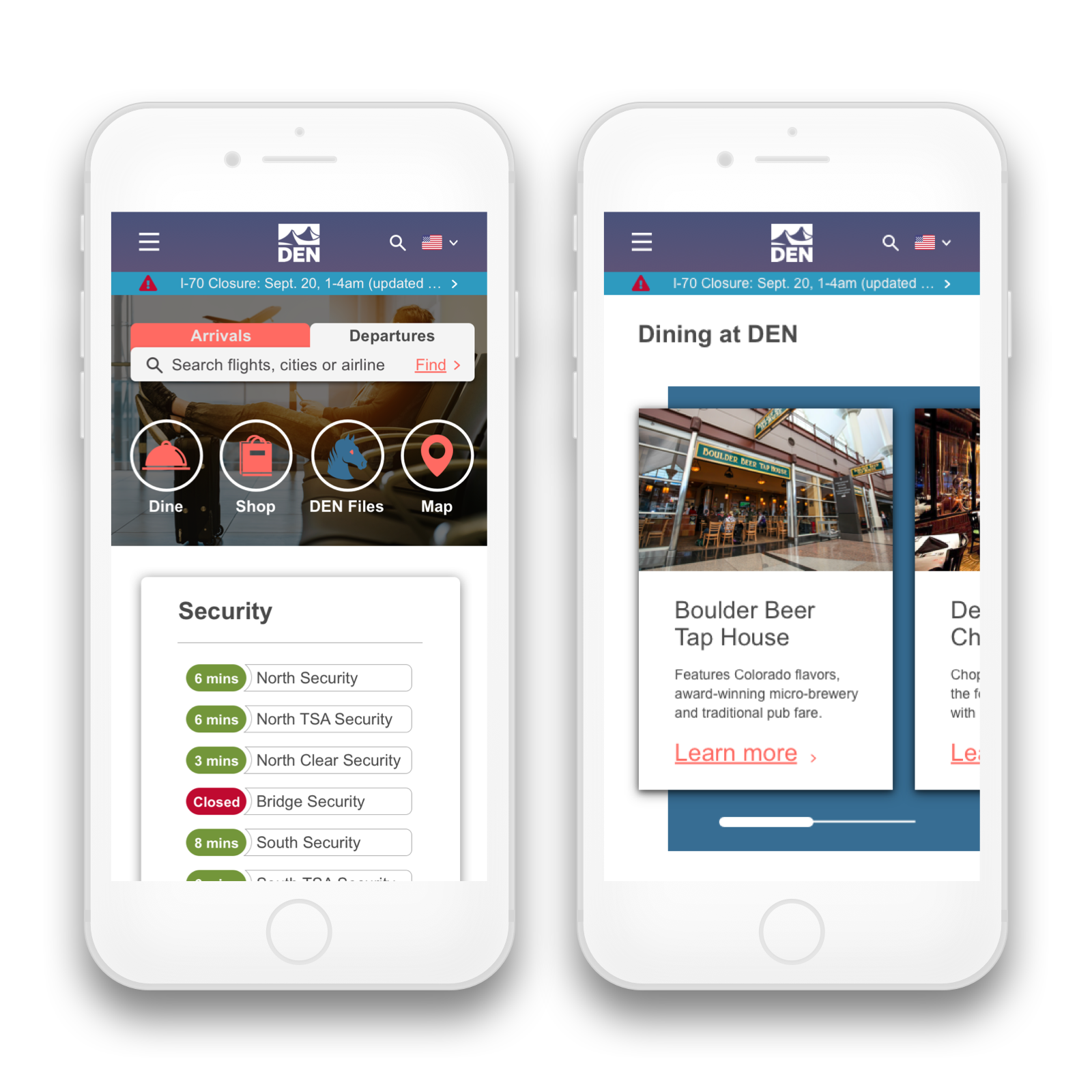
The homepage serves as a place for essential information as well as exploration. The flight search function is front and center, that way you can quickly and easily check that your plane is on schedule. Below the flight search, there are four icons directing users to some of the most popular features on the website: Dine, Shop, DEN Files, and Map.
Further down, there are the security and parking info cards, which provide up-to-date wait times and open or full status of parking locations to help people quickly plan their airport experience. Lastly, we designed informational cards that scroll horizontally to highlight certain elements of the airport or Denver culture. These address the unique cultural pull that Colorado has and allows for visitors to better explore potential entertainment and food options or discover unique information.
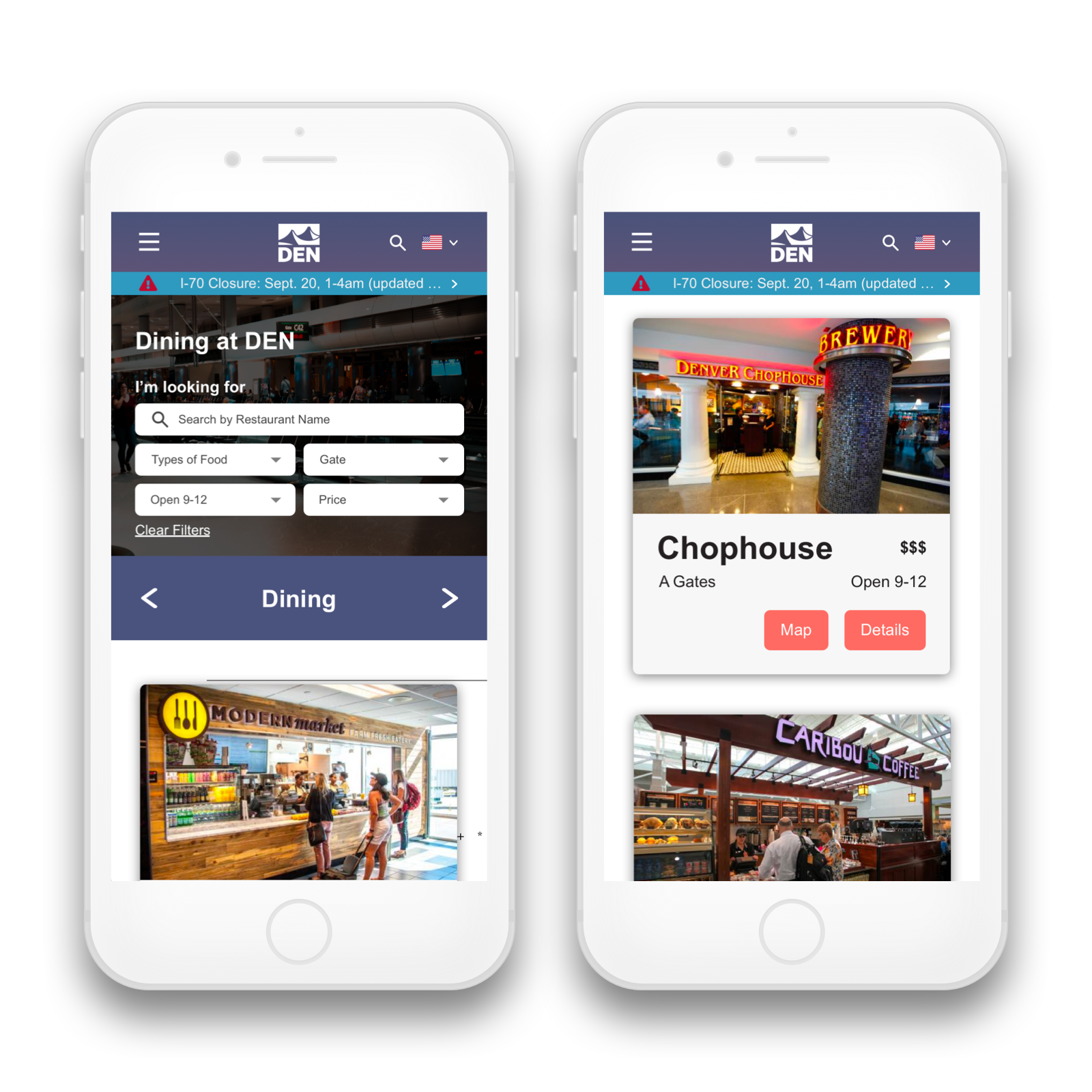
The dining page needed information consolidation and visualization or order to make searching for things more user friendly. We decided to present the dining options using engaging and eye-catching navigation cards.
We tailored the search filters around the dining experience. For example, users can filter restaurants by gate or hours of operation. These elements are also easy to see on the information cards themselves. Images of the restaurants further allow someone to quickly scroll their selections and find what they are looking for. In addition, there are two simple calls to action that give you the location on the map or additional details.

The flight search component from the homepage works with the flights page to get the viewer to their results as quick as possible. This information is still best viewed in a list, but we improved the hierarchy to show the airline branding and a color signifier if it is on time, late, or delayed.
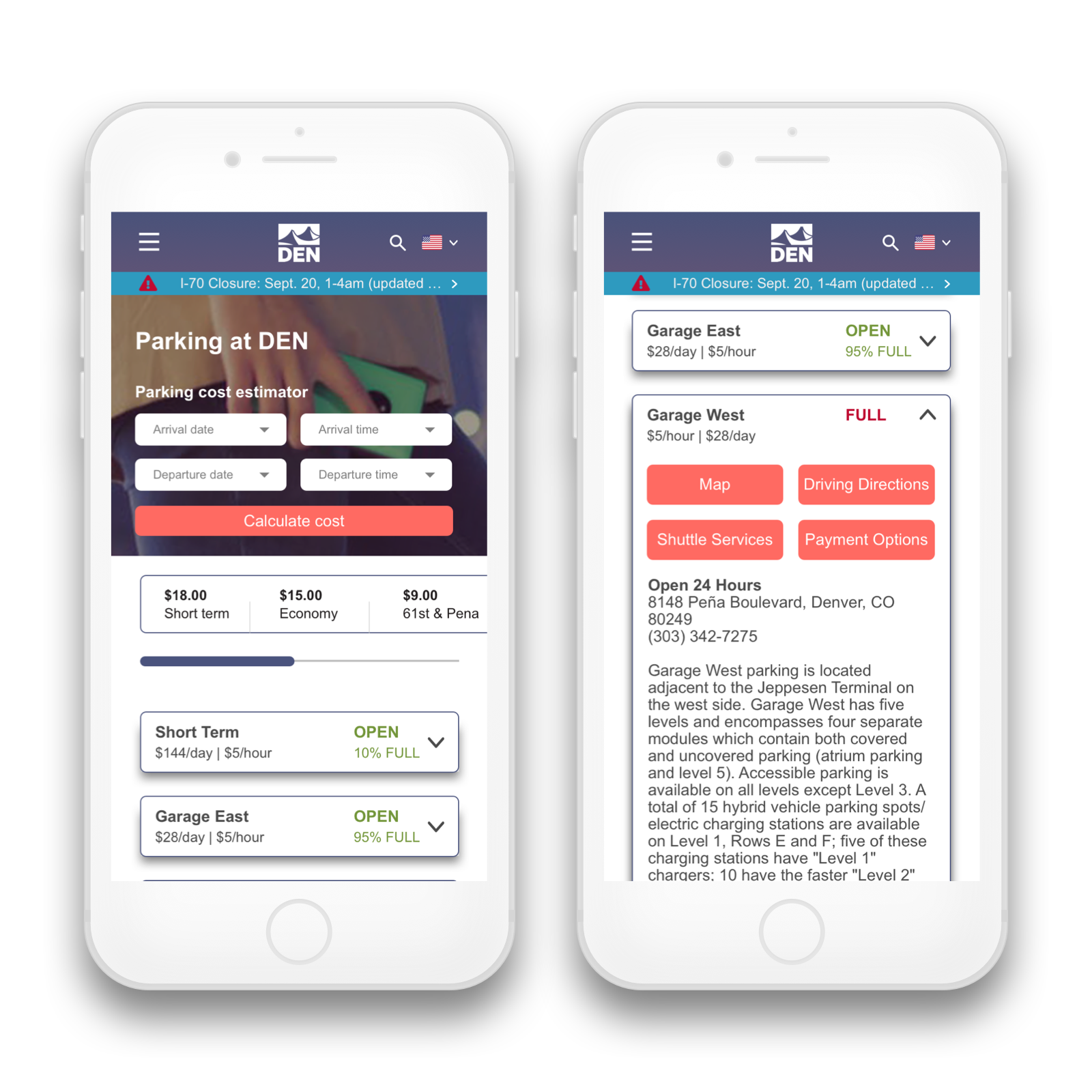
We decided that the best way to help a user find out where to park would be to create a feature that allowed them to enter their flight details and receive price estimates for different locations.
We utilized tabs that highlight the location, cost, and availability of each location for easily-accessible information. If the user needs to know more, they can tap the tab to expand the view with options for the map, directions, shuttle and payment options as well as the detailed description.
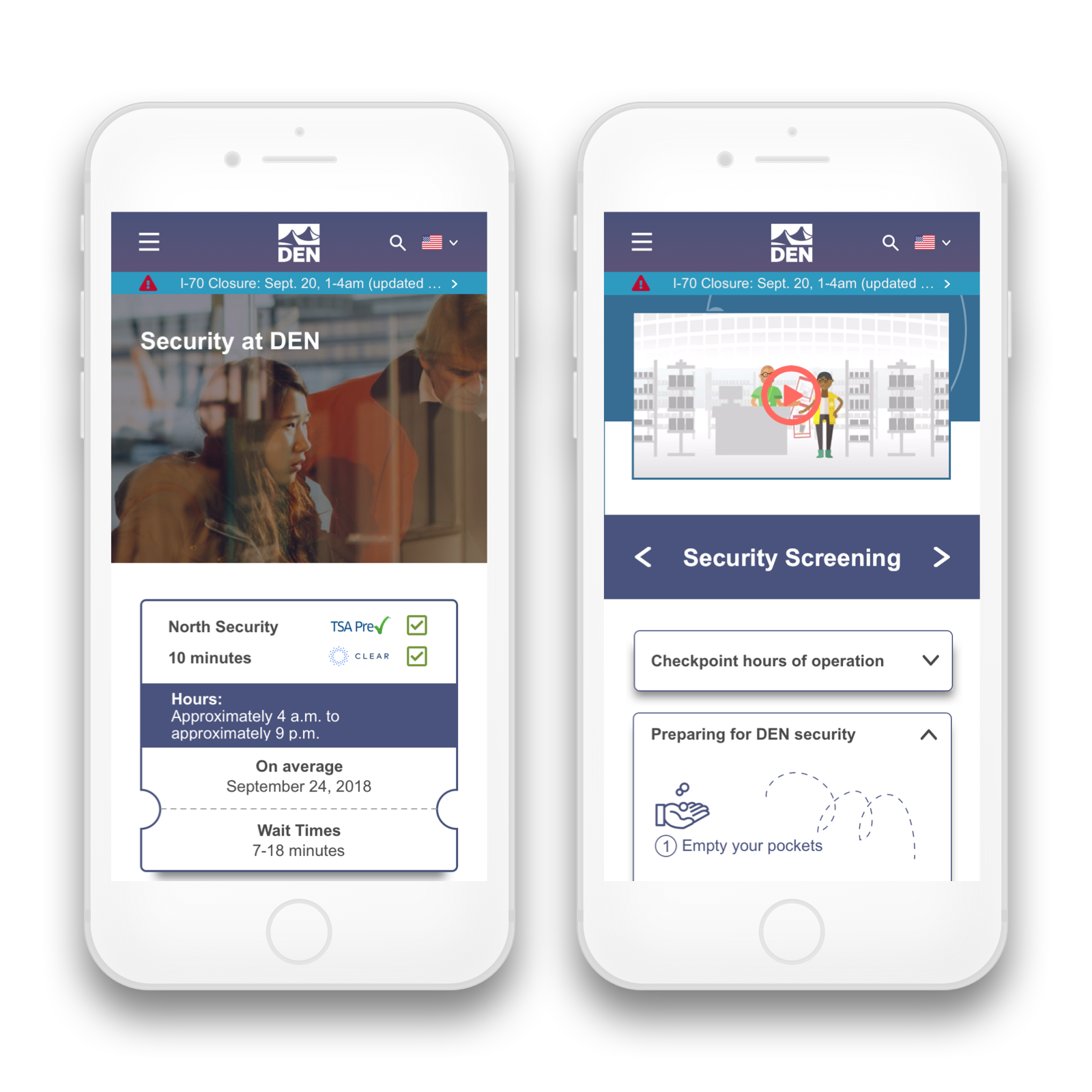
We designed the security information to display up-to-date wait times and closures on the homepage while providing in-depth information on the security page. Additional information is located under tabbed drawers on the page and covers things such as security screening and customs. We also utilized video resources and a visual infographic that we created describing how to prepare for Denver security.
Marketing
We knew from our research that we needed to address the marketing strategy in order for the website re-design to have a greater impact. There is no shortage of real estate in both physical and digital signage at the airport to market the benefits of the website.
Retrospect
Overall our proposed re-design improves usability through refined information architecture and offers a much more visual experience. On top of that, the user-friendly tools to find wait times, dining options, and parking costs create a design that is better suited for people who are on the go and looking to have the best experience at the Denver Airport.
Phase two would consist of user testing these solutions further and bringing these design decisions to other parts of the website. This combined with the refinement of marketing materials would put Spire Digital in great standing for the full re-design.